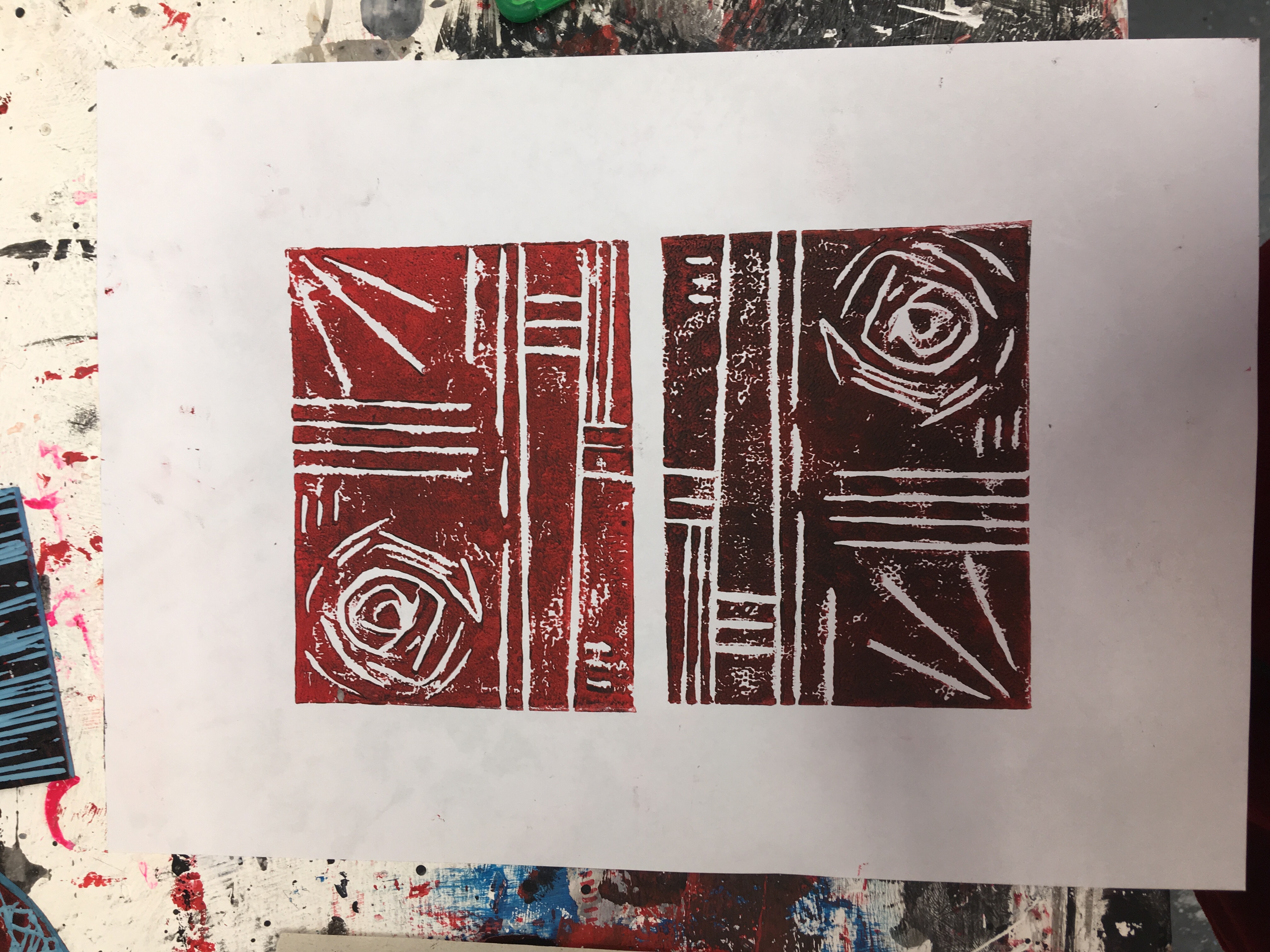
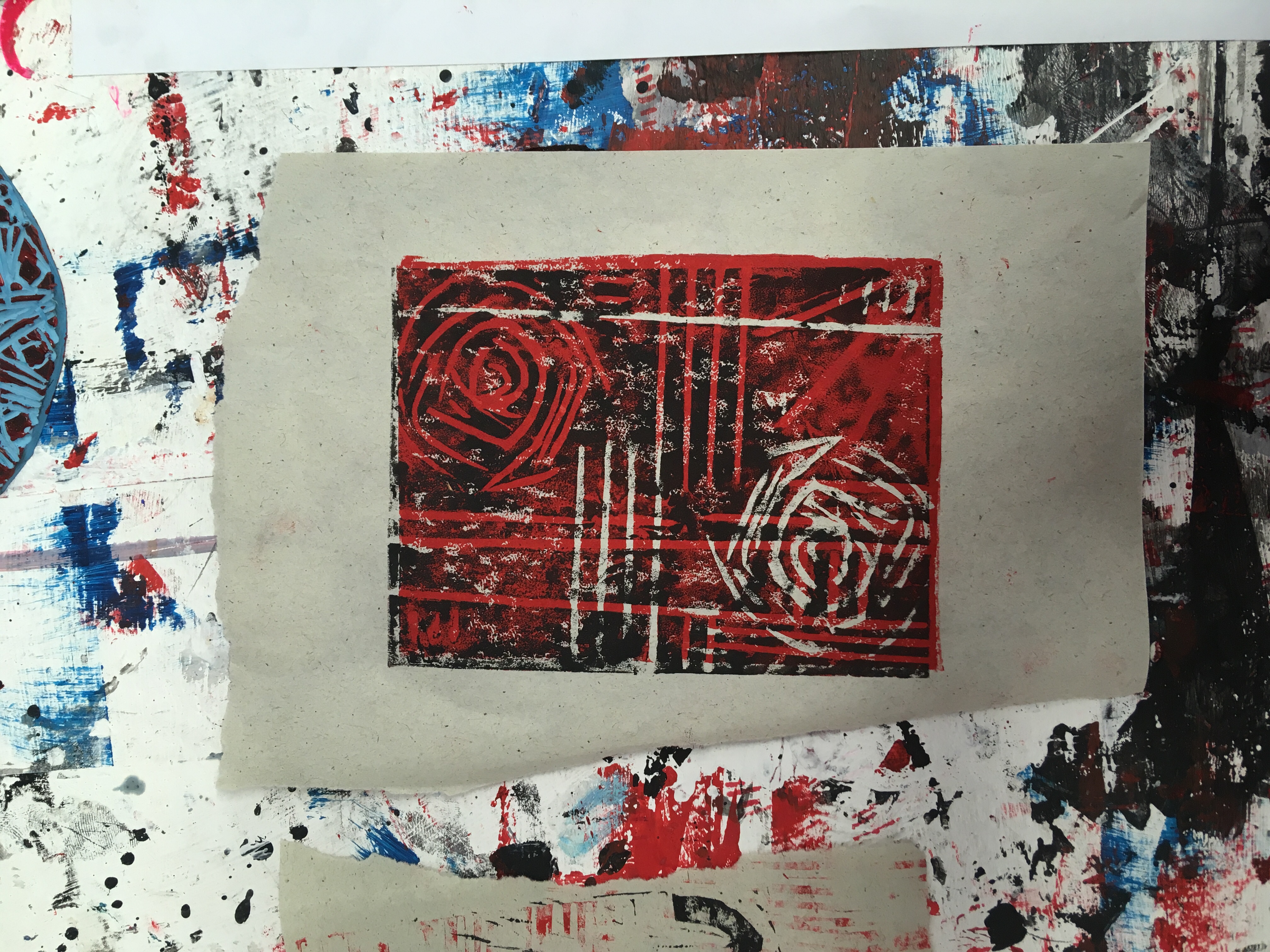
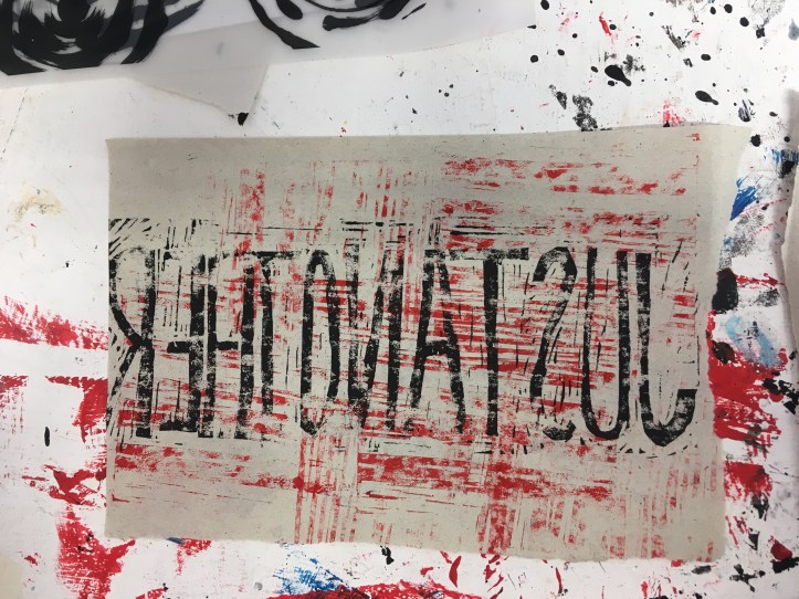
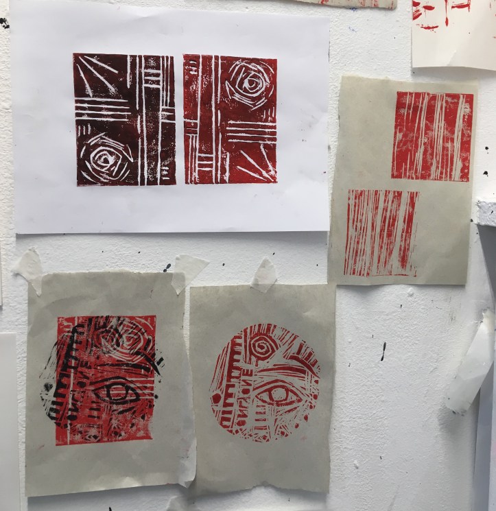
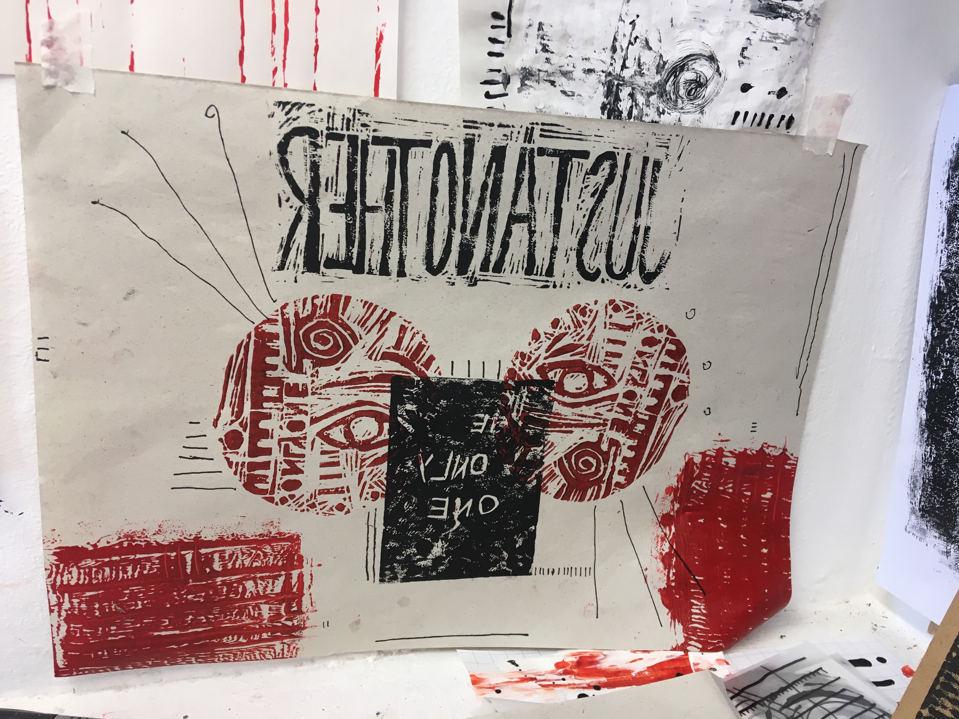
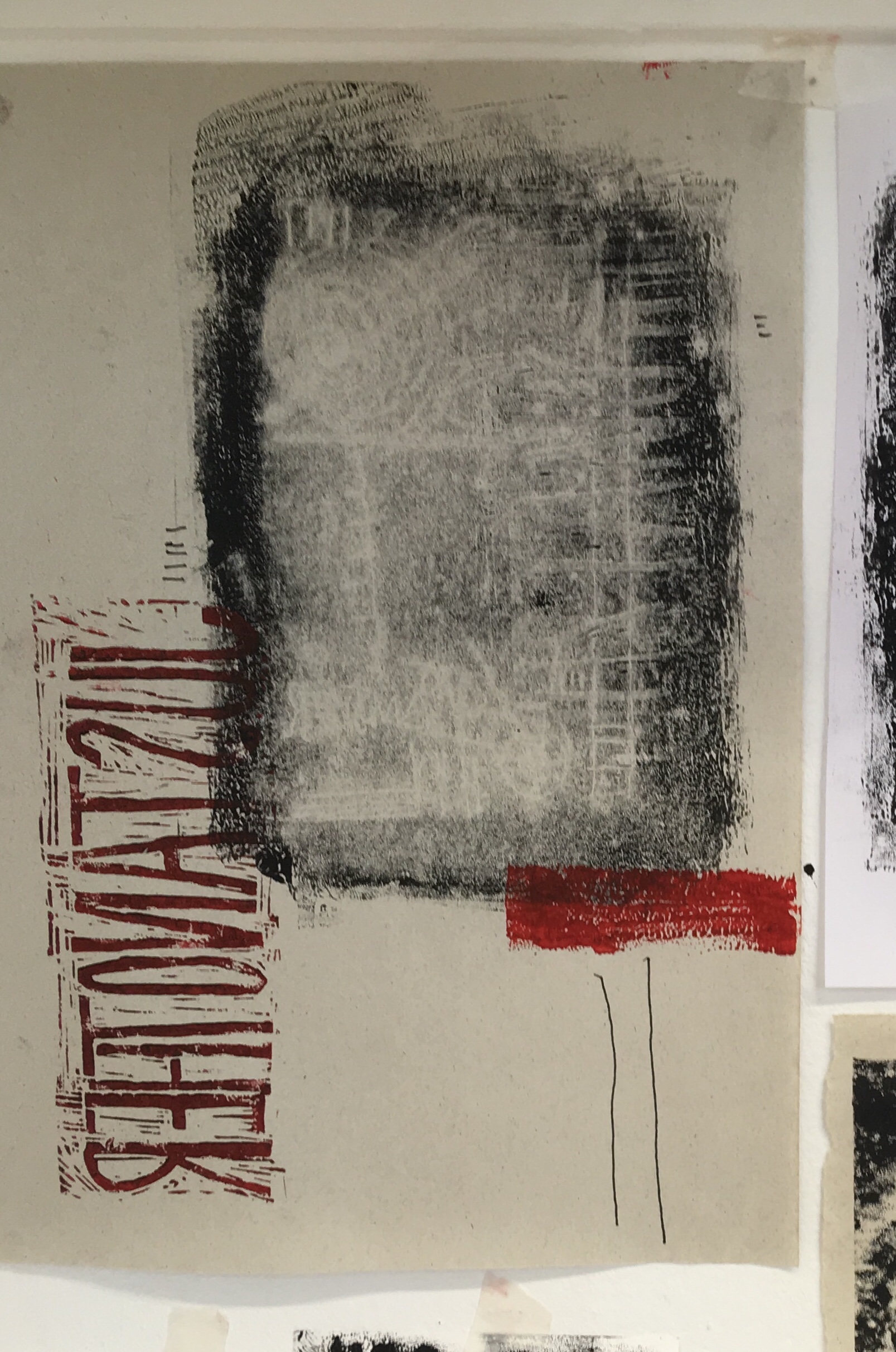
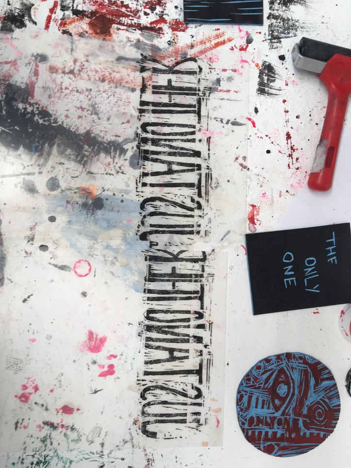
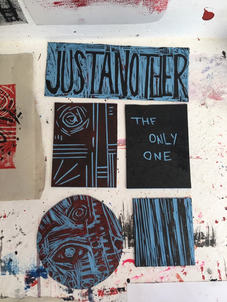
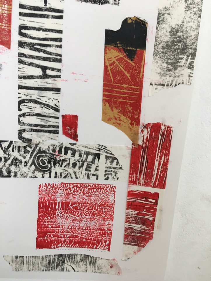
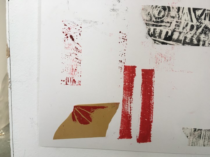
Collection of my lino cuts.I really liked the repetitive effect of using the same stamp together but flipping the other upside down.Layering the same lino cut over itself using different colours.Working with overlapping prints – I thought this one looked too messy and sinister. I also didn’t like the difference in size of the separate prints.
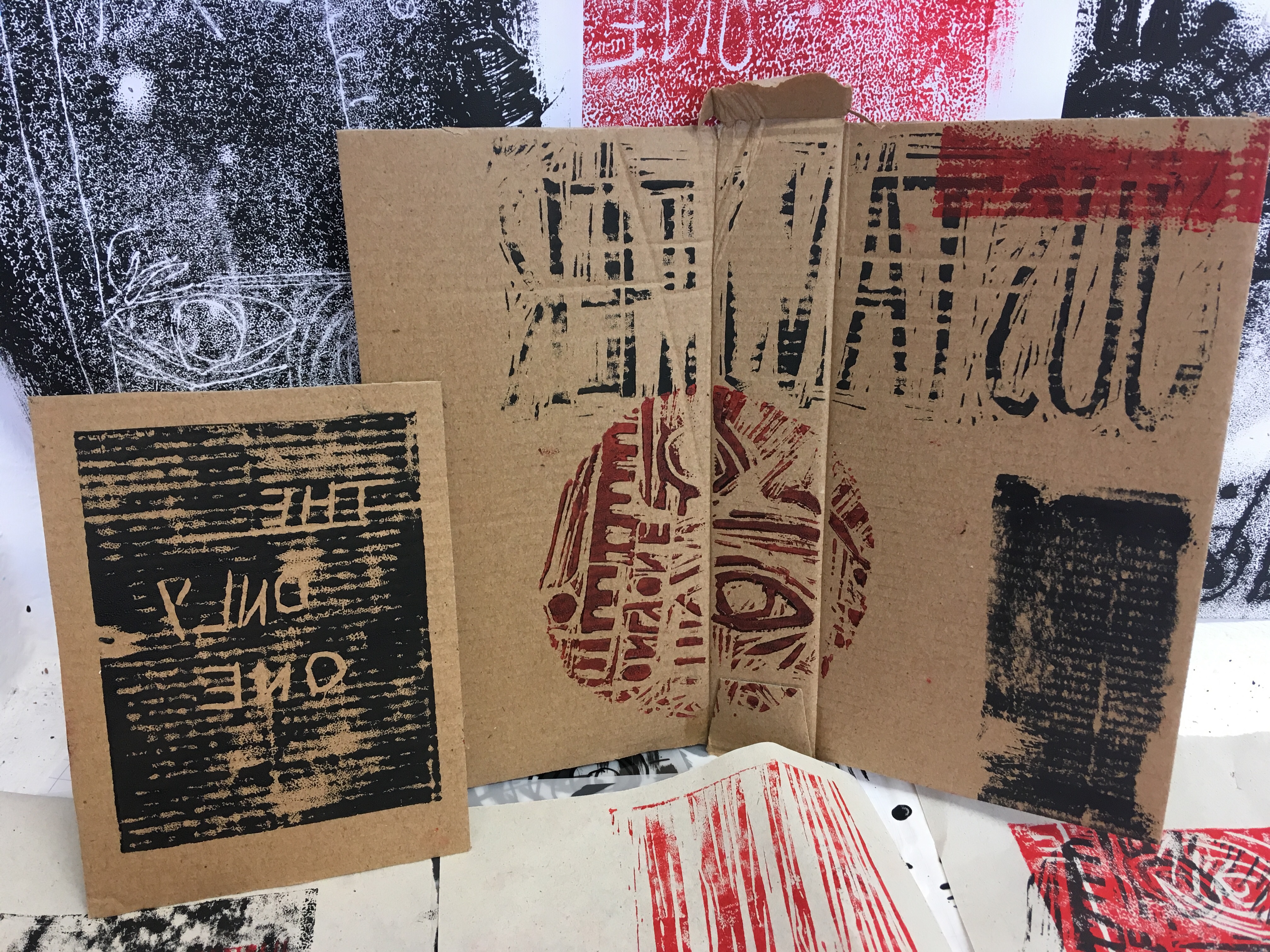
Working on different surfaces. I picked the right piece of cardboard as it reminded me of a book and I thought this added an interactive element to my prints. The calming connotations of a book clashed with the themes, topics, and colours used in my work.
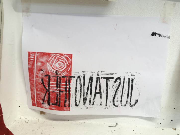
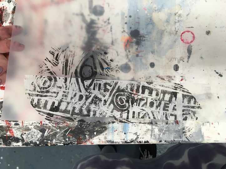
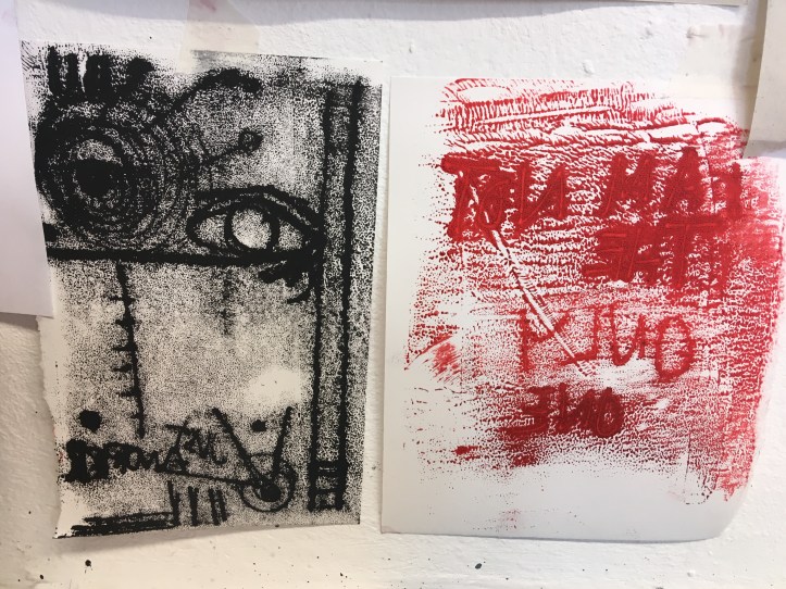
I then started to work with mono print and combining this with the lino cut pieces.
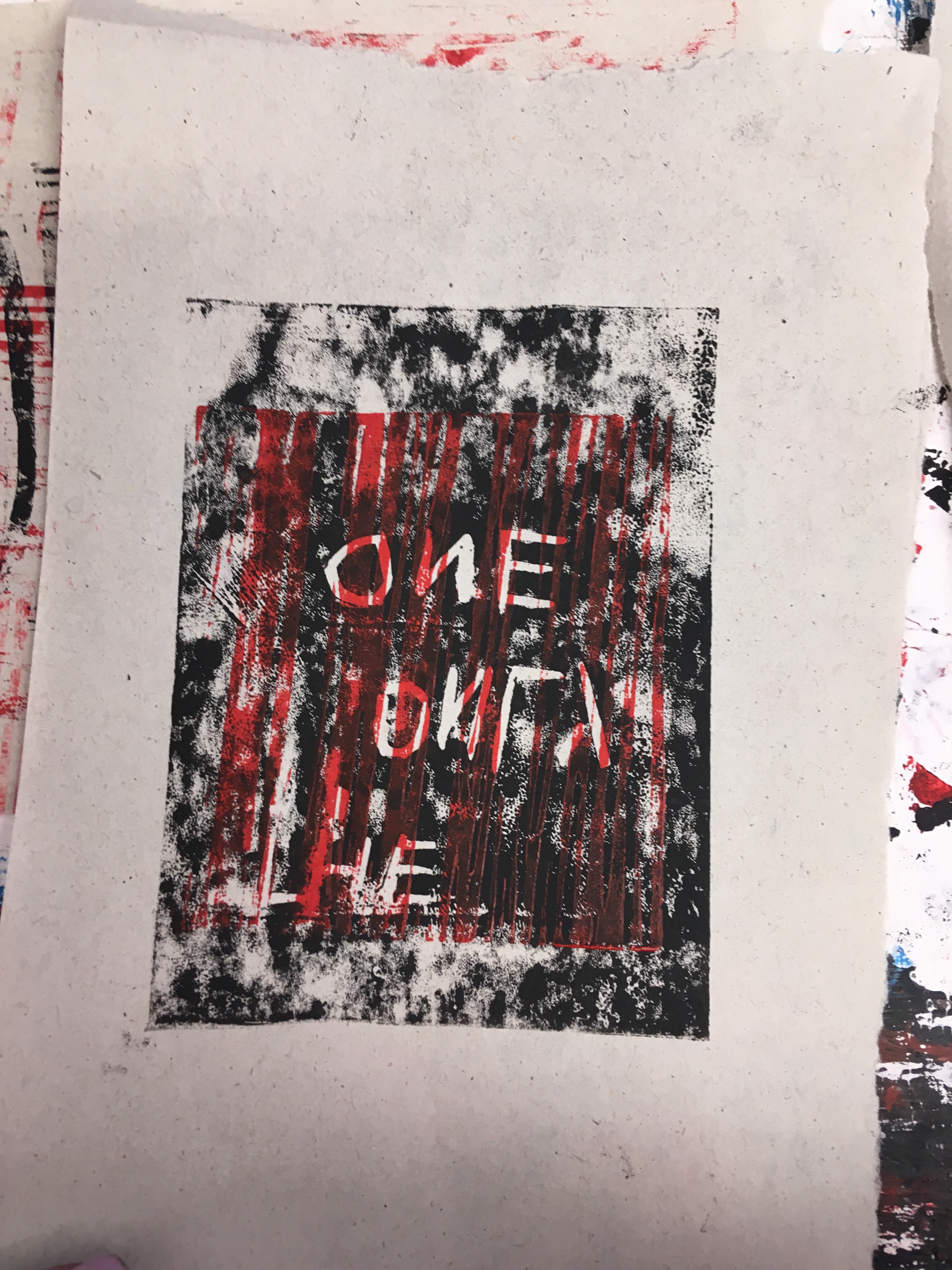
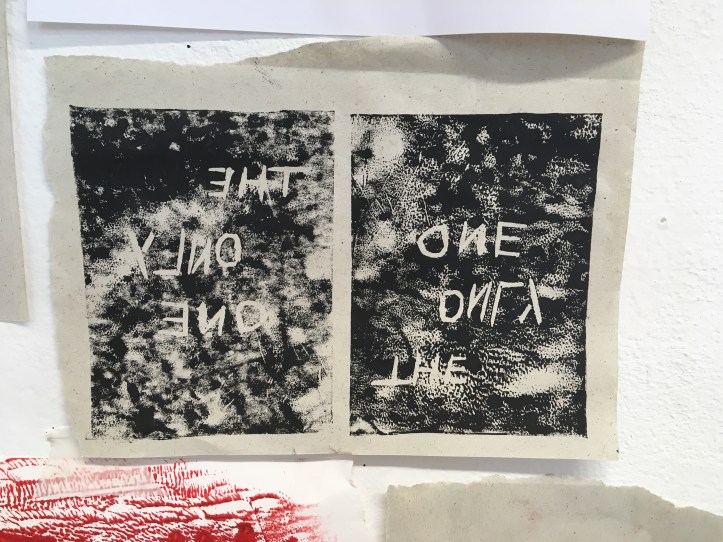
A successful mono print. I preferred the look of this piece presented upside down. It reminds me of the night sky.Using a variation of lino cuts, pen, and mono printing. I was happy unhappy with how the mono print came out as the ink was too thick which his the pattern I was trying to show.
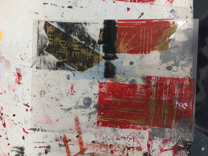
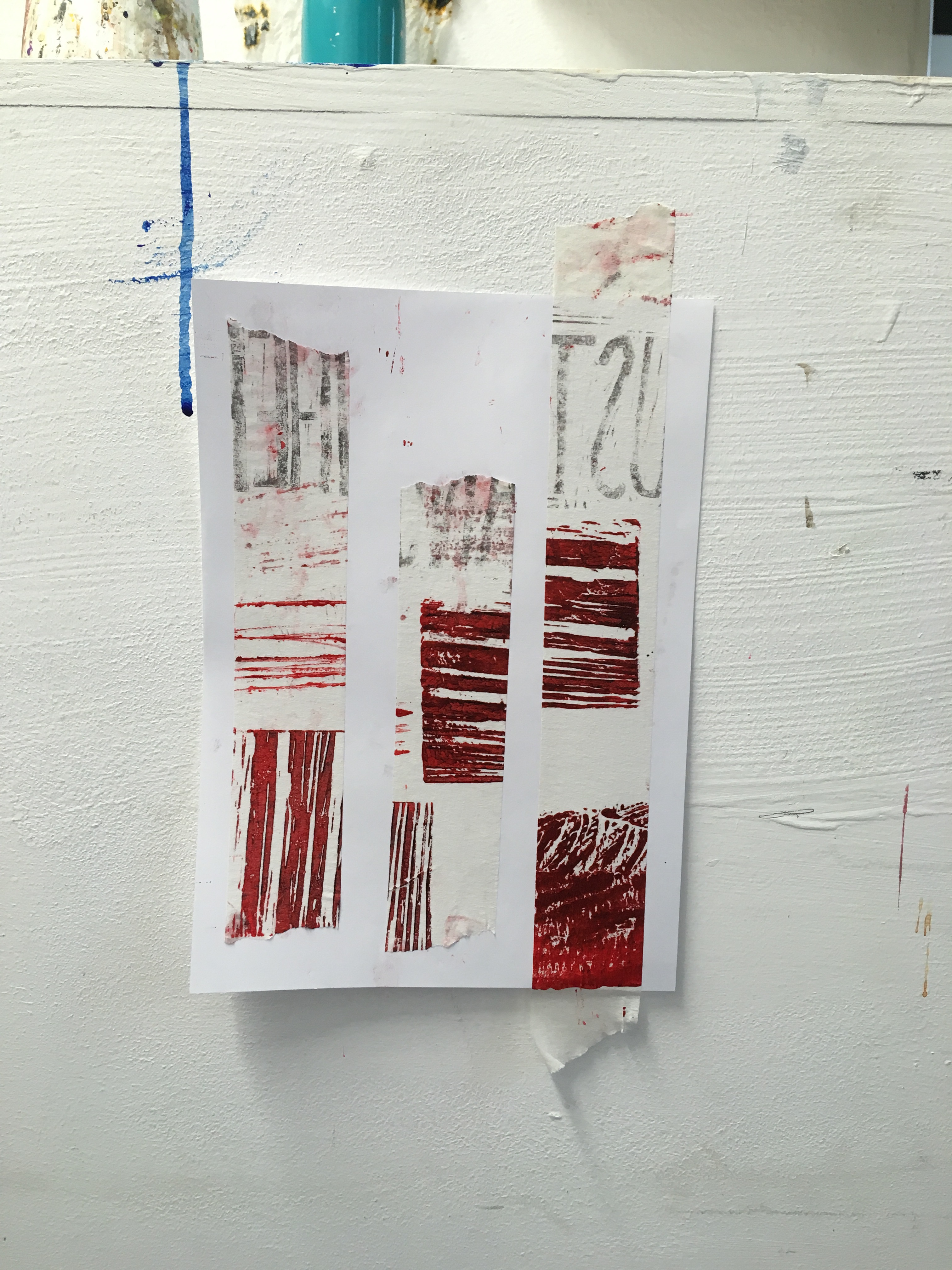
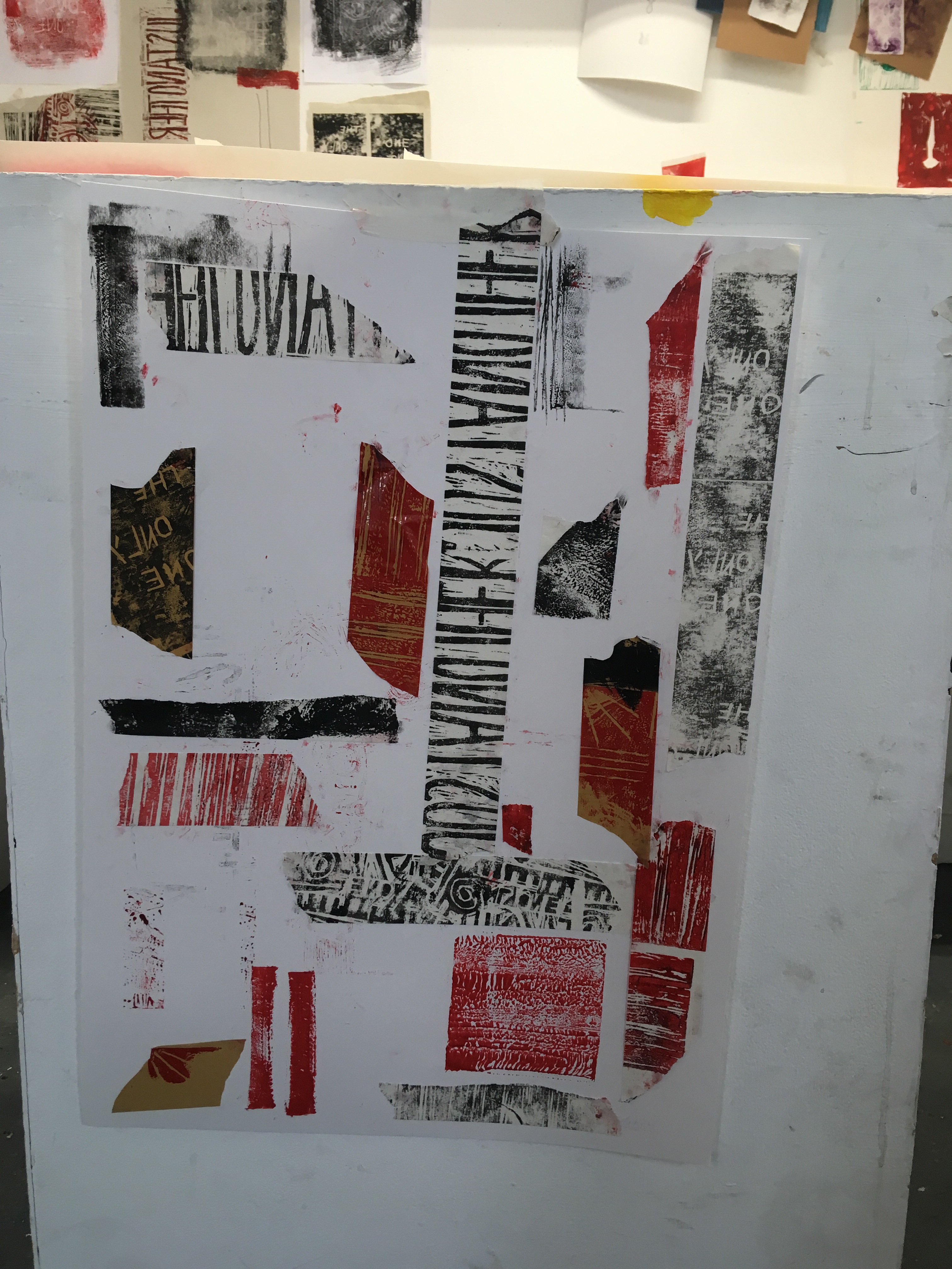
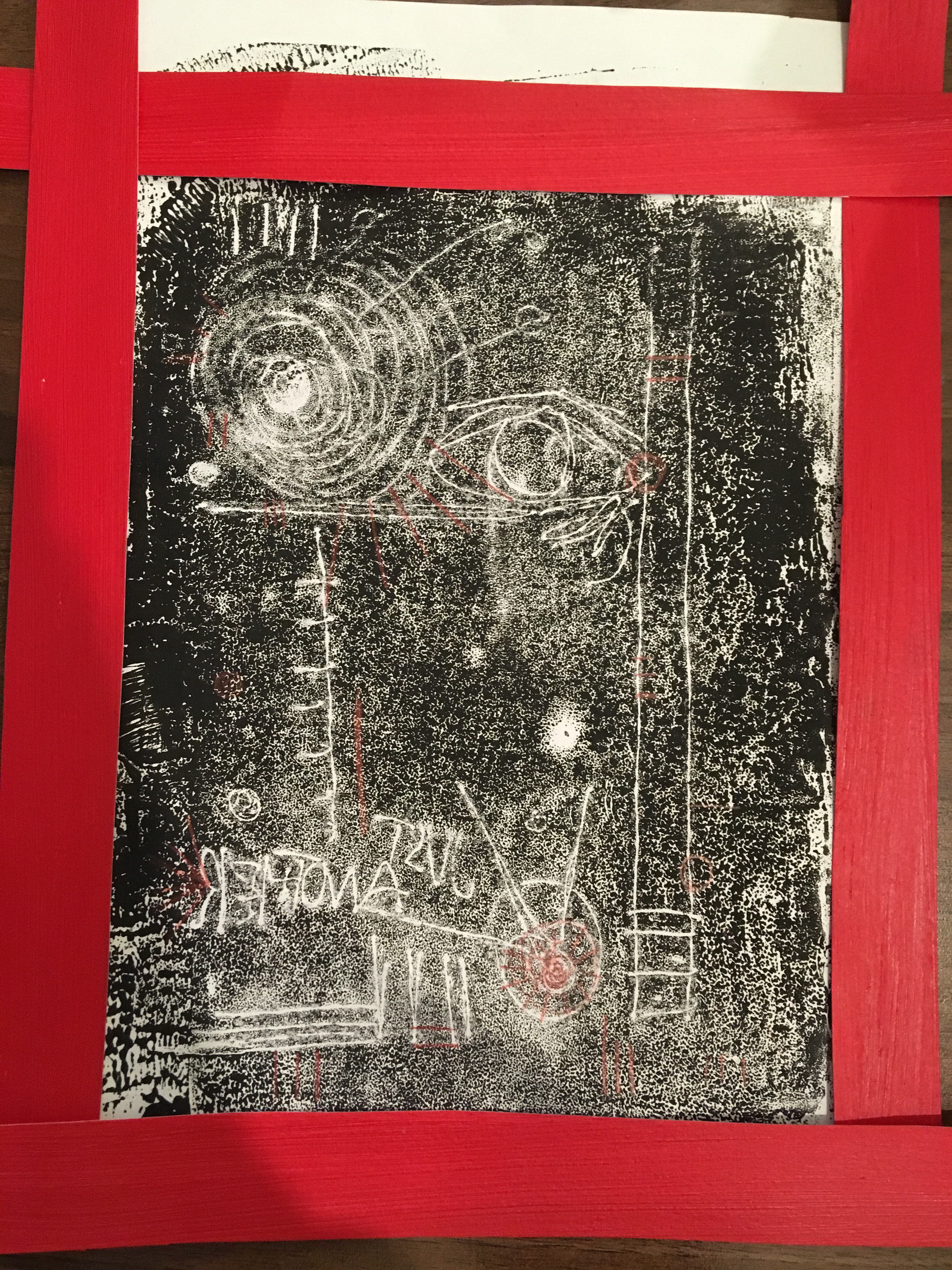
Arranging tape on top paper.Experimenting with presenting tape on paper.Full piece.Working with framing. Using pencil on top of mono print.